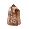
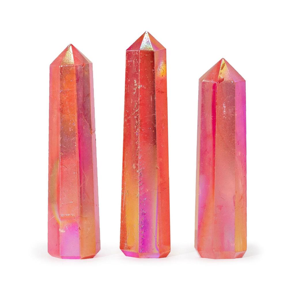
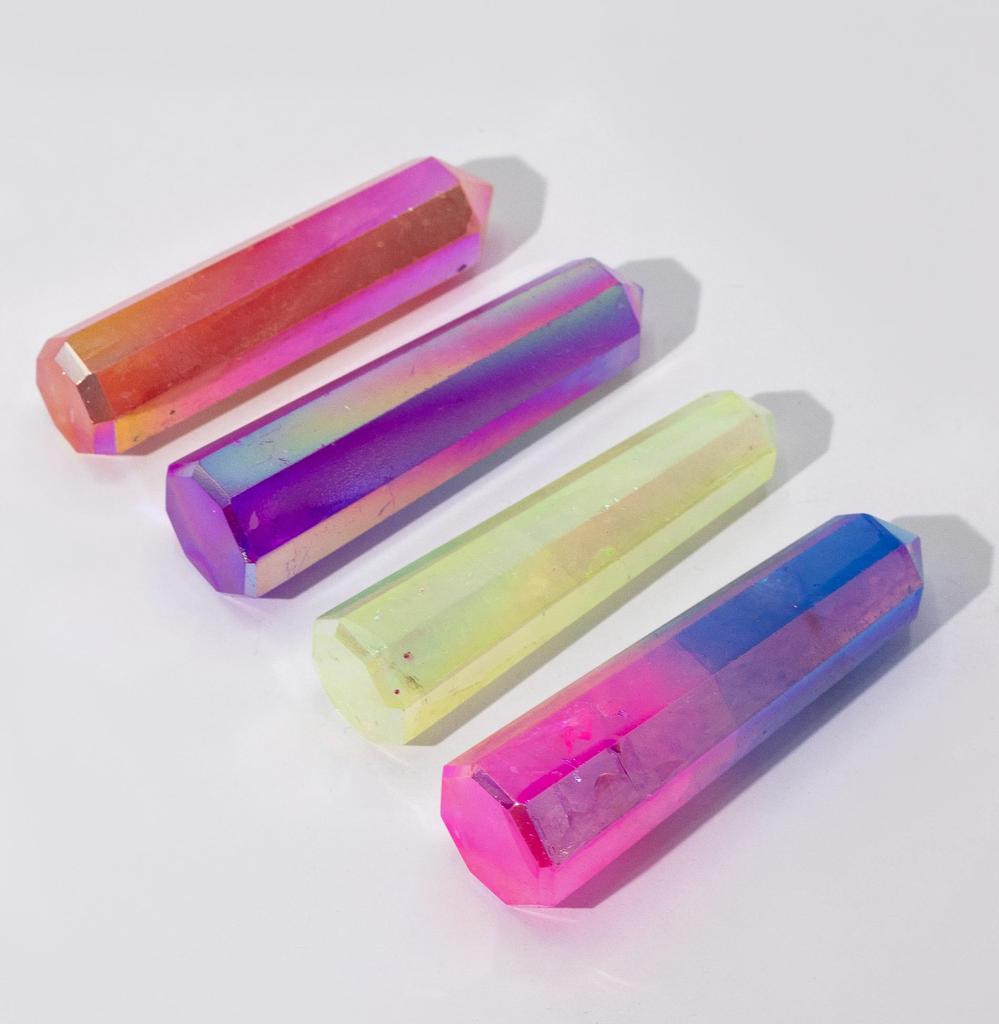
A polished quartz obelisk standing approximately 9cm tall, coated with a metallic vapour treatment that gives the surface a warm peach iridescent sheen. This is the warmest colour in the aurora crystal quartz obelisk range — soft, golden, and faintly rose-tinted, with a glow that looks particularly alive in natural light. Where the pink and blue leans cool and the purple leans dramatic, the peach sits in genuinely warm territory — the colour of late afternoon sun on pale stone.
The Colour
Peach aurora quartz gets its colour from a combination that typically includes gold in the vapour deposition process, which produces the warm, rosy-gold spectrum. The surface shifts between soft peach, pale copper, champagne gold, and hints of rose as the light changes — it is not a single flat colour but a gentle, warm shimmer that moves across the stone's surface.
The warmth of this coating interacts well with the natural translucency of the quartz beneath. In pieces with good clarity, the peach colour seems to glow from within rather than sitting only on the surface. This gives it a softer, more organic appearance than the cooler or darker variants — it looks less metallic and more like a naturally warm stone.
In natural daylight, the peach reads as a warm, golden pink — inviting and easy on the eye. Under warm artificial light (standard incandescent or warm LED), the gold tones become more prominent and the obelisk takes on an almost amber quality. Under cooler lighting, the rose and pink undertones come forward. This colour-responsiveness makes it one of the more interesting variants to place in a spot where the light changes throughout the day.
Peach is the colour most likely to appeal to someone who does not usually gravitate toward crystals. It reads less as a "crystal object" and more as a warm, beautiful decorative piece — approachable and unpretentious. This makes it an especially good gift for someone who appreciates beautiful things but might not identify as a crystal person.
Warm Tones, Warm Spaces
The peach obelisk looks best in warm-toned settings — cream or white surfaces, light wood, terracotta, warm metals like brass or copper. It also works well as a contrast piece on a cool grey surface, where the warmth of the peach stands out without competing. Bedside tables, bathroom shelves, and dressing tables are all natural placements for a warm-toned crystal — spaces associated with personal care and quiet moments. The 9cm height and freestanding obelisk shape are described in the Pink and Blue listing for this range.
Peach Quartz in Crystal Practice
Warm-toned aura quartz — peach, tangerine, and gold shades — is associated in crystal practice with the sacral chakra, which relates to creativity, warmth, emotional expression, and connection. Practitioners use warm aura quartz for self-confidence, releasing self-doubt, and encouraging openness. The gentle peach colour is seen as particularly nurturing — less forceful than orange or gold, more about comfort than ambition. These are traditional associations in crystal practice communities, not verified claims.
Common Questions
How does peach compare to pink and blue?
Pink and Blue is cool-toned — metallic, shimmering, and distinctly iridescent. Peach is warm-toned — softer, more golden, and less obviously metallic. If you tend toward silver jewellery and cool colours, Pink and Blue will suit your aesthetic. If you prefer gold, warm tones, and earthier palettes, Peach is the better match.
Is the peach colour subtle or obvious?
It is moderate — noticeable but not loud. In direct light, the warm shimmer is clearly visible and attractive. In lower light, it reads as a softly glowing, warm-toned crystal. It does not have the dramatic colour shifts of the purple or the metallic flash of the pink and blue, but it has a consistent, inviting warmth that many people find more liveable day to day.
Does peach aurora quartz pair well with other crystals?
It complements rose quartz, citrine, and clear quartz particularly well — all warm or neutral-toned stones that share its gentle character. It also creates an attractive warm-to-cool contrast when displayed alongside the pale green or pink and blue variants in this range.

 Produs din Marea Britanie


 Rambursare în caz de nelivrare


![[PIATRĂ AURIE] Piramidă Orgonit Opal Roz și Cristal de Cuarț Unic, Articole Spirituale, Lățime Aproximativ 55 mm](https://img.joomcdn.net/177630fbd83667ff827c490ab0316070ed4ec39e_100_100.jpeg)